Sean McLaughlin UI/UX Artist and Designer
Example of work done on NBA 2K Mobile Store Redesign
Store creation and revisions
When I first arrived on the project, it had a variety of ideas and wants but no direction for the player. I first mapped out the initial general flow of the UI and found areas that had too many taps to get to what you need. Of course the project's design was evolving as I was working on it so I found ways to present concerns and work with the system designer to address how the user would interact with the early designs.
Gold (Hard Currency) Purchase Modal
The main changes I provided on the Gold purchase modal was to provide a consistent list treatment and functioning layout to match what the new Store layout was going to become.
Pack Info Modal
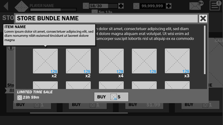
One of the main issues I wished to address on the store as we closed in on launch, was to surface to the user what they could ptentially get in a pack. Initial designs were to just have text strings of the basketball players with their power rating. Being that this is a more Gacha mechanic for the store of random chance to get cards in a pack, I felt it was better to visually show the cards that could be in a pack. This was also to match the current games in the same genre, much like FIFA and Madden Mobile.
Store Blueprints
As the product got closer to launch, I suggested a design that would allow for our store to be more dynamic and could be adjusted live by the team. The design I proposed was to bring in items driven by the server data to attach in different layouts on the store banners. This provided the designers more flexibility to change things live without the artist having to create baked down art and downloading to the client.
Season 2 Store Updates
Season 2 store was more about refinement to the visual banners, improving on the blueprint system by adding cards to dynamically attach on the list items and adding half high list elements for smaller items. There was also request to add store packs to the main menu,


