Sean McLaughlin UI/UX Artist and Designer
Process work for creating the Catalog in NBA 2k Mobile Season 1
Catalog and Card Interaction Revisions
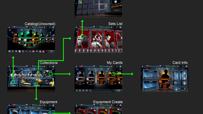
When I first arrived on the project, it had a variety of ideas and wants but no direction for the player. I first mapped out the initial general flow of the UI and found areas that had too many taps to get to what you need. Of course the project's design was evolving as I was working on it so I found ways to present concerns and work with the system designer to address how the user would interact with the early designs.
Sets Changes
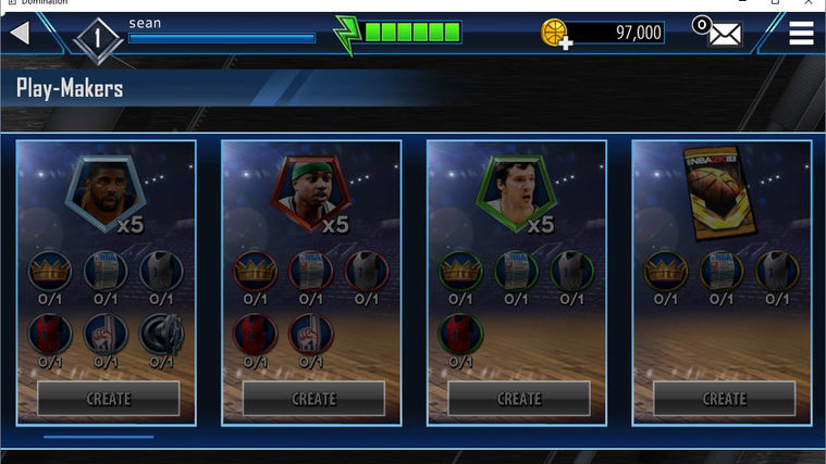
I started off in my usual manner of creating low fidelity wireframe mocks in Illustrator for the first revision. Mainly focusing on keeping the system designs as they are but presenting them differently. For example the "Sets" were recipe collections to create cards, but in order for the player to find the recipe, they had to tap in 2-3 levels deep depending on where they were in the UI. The first solution was to present the recipes on the banners themselves to reduce the extra tap. This sacrificed the banner art but gave the players quicker access to the chase prizes to create cards. Slides below show the progression of changes.
Catalog Update
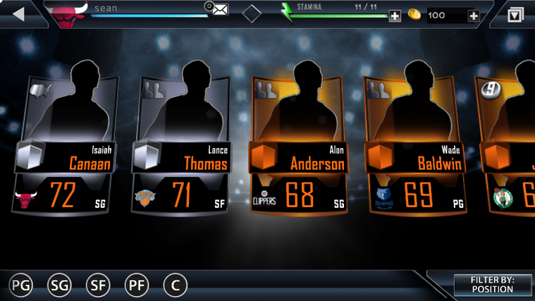
Instead of going with a collections landing that had banners to direct you to each aspect of card creation/ownership/progression, I felt a centralized one stop shop would be better. I simplified numerous pages to one page with 4 tabs. This provided less of going in and out of various full pages and limited the confusion of a player learning a new page and system for each different element of card creation.


